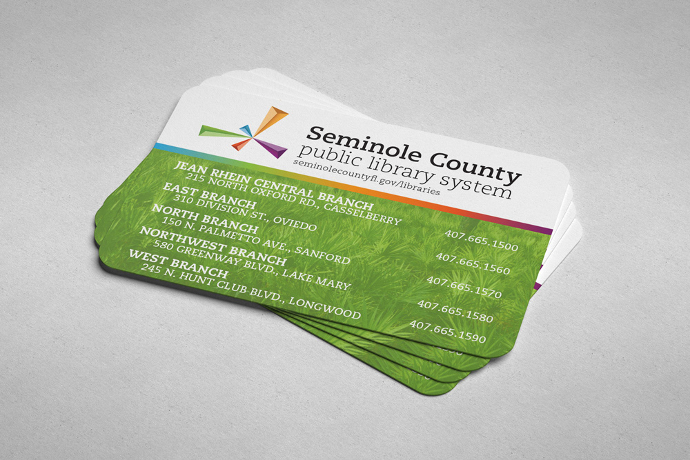
After acquiring my library card I noticed a clear difference in the vibrance and energy the Orange County Library System was communicating compared to Seminole County. The key points of focus would be a library system specific mark as well as color and typographic elements.
I first established a color scheme that had energy and variety since the library provides services for all ages and to curb any thoughts of it being antiquated. The mark is inspired by the 5 locations across seminole county and the 'burst' icon represents where each location is on a map.

I added depth to each ray in the form of a sculptural triangle since the 5 locations represented "penta" and a pentagram can be composed of 5 triangles. This was a concept built into the mark that could be further explored if a more comprehensive identity was created for the library system.